

Appearance
-

Connect Google Ads conversions to your store
27 Nov 2025
Measure purchases from Google Ads with the right conversion action, purchase value, and consent. This guide is for administrators with access to the store's active Diversity theme and the correct Google Ads account. Choose either the theme's built-in Google Ads connection or a well-thought-out Tag Manager installation for the same purchase. Do not follow both flows in parallel without checking what is being counted. 1. Choose what to count as a purchase A conversion is an action you have chosen to measure, such as a completed order. Conversion tracking is needed to link purchases to ads, not to distinguish all organic traffic from paid traffic in general. Check existing purchase actions before creating a new one. If the same purchase is sent both directly to Google Ads and via an imported Analytics conversion or Tag Manager, you must decide which one to use as the primary bidding goal. A common order ID does not automatically merge different conversion actions. 2. Get the correct send_to value from Google Ads Open the conversion settings in the correct Google Ads account.Select or create a website conversion for purchases. Specify that different values should be used for different conversions.Open the tag setup and the purchase action's event snippet.Get the entire value after send_to: it contains an ID with the prefix AW- and a label after the slash, for example AW-123456789/AbCdEfGh. Google changes the location of menus. The images show an older interface and help you recognize the choices for website, purchase, and event snippet; follow the features above in your current account. 3. Add the value to the active theme Go to Appearance → Themes and open the active Diversity theme for editing.Open Add-ons → Google.Find Google AdWords Conversions.Paste only the full value AW-ID/label, without quotation marks or HTML code.Save and check the published store. Do not paste the entire event script in this field or an extra copy in the header. If the field is missing, check the active theme and theme version. TPL and custom implementations have a different installation flow. 4. Understand what value is sent The theme's built-in Google Ads connection sends the order's total amount including VAT, shipping, and any payment fees, the order's currency, and the order ID as transaction_id. The connection runs in the visitor's browser. It is not a server-based guarantee that every order will be registered in Google Ads. For purchases through the theme’s Tag Manager data layer, ecommerce.value is the merchandise subtotal excluding VAT; shipping and tax are separate. A custom tag can therefore send a different value from the built-in Ads connection. Choose the intended value basis and compare reports using the same definition. Do not change the store’s VAT settings to correct a reporting value. 5. Check consent and measurement Check the store's consent solution and Google Consent Mode settings before using advertising data.Use Google Tag Assistant to check the correct account, conversion label, and consent signals.Place a controlled test order according to your procedures if you need to verify the purchase event. Check that the correct action receives an event with the expected amount, currency, and order ID.Check Google Ads diagnostics after its normal reporting delay. A test of the tag is not a promise that the purchase will be attributed to an ad. Avoid duplicate scripts, duplicate primary purchase actions, and reloading the confirmation page as the only testing method. The absence of a registered conversion may be due to consent, browser protection, the wrong label, a lack of ad connection, or reporting delay. A payment refund does not automatically mean that a previously sent conversion is corrected in Google Ads. Quickstart Check existing purchase actions and choose a measurement path.Get the full AW-ID/label for the correct purchase action.Fill in Google AdWords Conversions in the active Diversity theme.Check consent, event, and value basis. Subscription and costs The Google settings in Diversity are not a separate Plus or Pro add-on. The fields depend on the active theme and version. Ad costs and Google account settings are separate from the Abicart subscription.
-
Set up and check Google Consent Mode v2
27 Nov 2025
Let Google's tags get the right consent signals and check that they follow the visitor's choice. This guide is for those who administer Google measurement and advertising in Abicart. The built-in connection is described for Diversity themes with Google's settings. If you use TPL or an external consent platform, you should follow that solution's own connection. Check the store's active theme first; do not change the theme to make a field appear. 1. Distinguish the consent banner from Consent Mode The consent banner collects the visitor's choice. Consent Mode sends the consent status to Google's tags. It does not replace a functioning consent solution, information for the visitor, or the assessment of what data you are allowed to process. Turning on two settings is no guarantee of GDPR compliance. Consent Mode v2 includes, among other things, ad_storage, analytics_storage, ad_user_data and ad_personalization. The last two apply to user data for advertising and ad personalization, respectively. Google's requirements for ad measurement and personalization depend on the service, usage, and region; this is not a general legal requirement for all websites to activate all signals. 2. Check the store's consent solution Open the active Diversity theme under Appearance → Themes → Edit.Open the settings for Cookies under Add-ons.Check that the consent function is on. If non-essential cookies require active consent, they should not be allowed before the visitor has made a choice. Check this in the public store according to the steps below; the default mode does not have a separate visible choice in all themes.Check the texts, choices, and link to your cookie information. The option Require consent (Demand consent) makes the consent banner a modal dialog: the visitor needs to approve or deny before the store can be used. This choice alone does not determine which tags or cookies are allowed. A modal banner is not in itself proof that the installation complies with all applicable regulations. Do not turn off the consent function to make measurement work. A disabled feature or a permissive default mode can send granted signals before a new choice is made. Custom scripts and tags must also respect the consent; the theme's setting does not automatically control every custom integration. 3. Select Google's marketing signals Open Add-ons → Google in the same active theme.Find Marketing settings for Google Consent Mode API (v2).Select Share and use user data (ad_user_data) and Track user for personalized ads (ad_personalization) only for the use you have decided on and provided information about.Save the theme's changes and check the correct published store. These choices do not mean that all visitors have consented to marketing. The signals are granted only when both the corresponding theme choice and the visitor's marketing consent allow it. If one of the theme choices is turned off, that signal must remain denied even after marketing consent is given. 4. Check before and after the visitor's choice Open the store in a new browser session without previously saved consent and connect Google Tag Assistant.Check the initial consent status before making a choice. If active consent is required, relevant advertising and analytics signals must be denied before consent is granted.Choose to deny and verify that the relevant signals remain denied.Test granting consent in a separate, clean session and check the consent update.Open the page again with a saved choice. A previous consent can explain why signals are already granted; this is not the same test as for a new visitor. Also, verify that the default consent values are set before Google's tags and that the correct container is used. Do not place the same Tag Manager container in both the theme's Google field and as an extra script in the page header. Duplicate installations can cause incorrect ordering or duplicate events. Do not disable visitor protection to hide a warning. If you use TPL, an external CMP, or are missing the fields The instructions for Diversity should not be copied directly to TPL's separate Consent Manager (TPL) or an external CMP. Determine the active theme, what sets the default values, and what updates the consent. If this is unknown, contact support with the store ID, theme name, CMP, and a description of the setup before adding new scripts. Quick start Identify the active theme and consent solution.Check the consent feature and how a new visitor is handled.Select the relevant Google signals and save.Check a new visitor, a denied choice, and a granted choice in Tag Assistant. Subscription and applicability The consent settings in a Diversity theme are not a separate Plus or Pro add-on. The available fields depend on the theme and its version. Changing your subscription does not replace a correct consent setup. Google accounts, any CMP, and custom tags have their own terms.
-
Event counting
27 Nov 2025
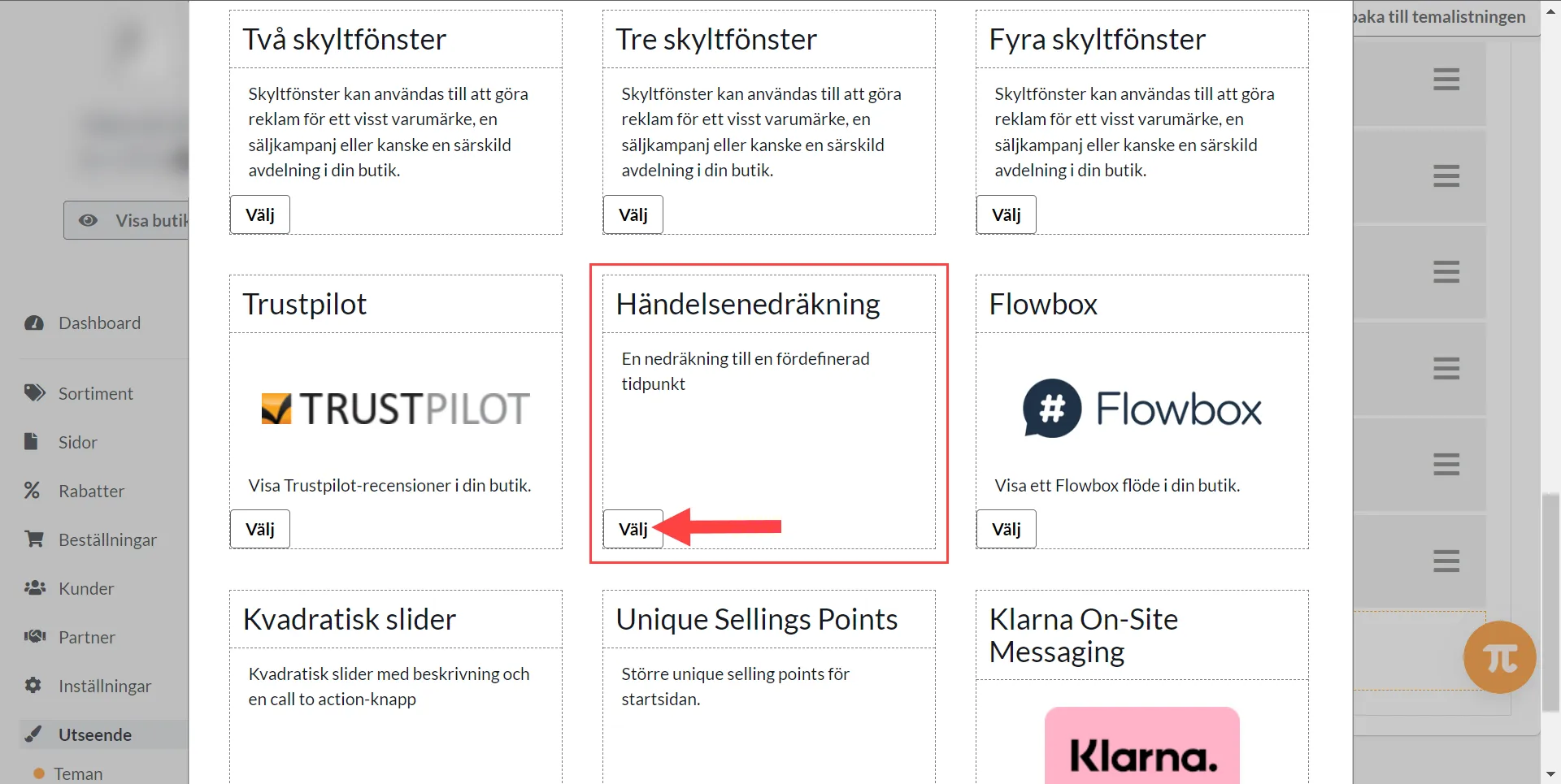
Here's how to do it: 1) Appearance >> Themes >> Edit Theme2) Home page >> Add Block >> Event counting3) Set the block >> Finished >> SaveTry our text banner in combination with the countdown. The text banner is visible on every page while the countdown is only visible on the home page.
-

Text banner
27 Nov 2025
Activate a text banner in the theme that appears at the top of all pages.What is a text banner?A text banner is a field you can activate at the top of the page where you can enter a text to inform about something, such as a temporary offer, free shipping or something else. You can also add a button and link it to a page, product or product group.How does the text banner work?A visitor can choose to remove the text banner by clicking on the checkbox at the far right. This choice is saved in the visitor's browser and the banner will not be shown again. To see the banner again, you need to clear your browser's cookies.Activate the text bannerYou activate the text banner in the theme under Settings -> Themes -> edit the active theme and then go to the tab "Add-ons" -> Text banner. Click "On".Main textA field to enter optional text.In this example we have free shipping on all products that have a special price and enter a text informing about this.Button textYou can choose to have a button that links to a page, product or product group. Enter a text to be displayed on the button.LinkChoose where the button should link to, a page, product or product group. In this example, we want to link to our own page that shows all products with special prices. Check "Pages" and then select the "Discounts" page.Background color for text bannerSelect the background color by clicking on the color box on the right.Color of the button in the text bannerSelect the color of the button by clicking on the color box on the right.Don't forget to save when everything is done. Then just preview and display the banner at the top of the shop.
-

Add logo for payment and delivery methods
27 Nov 2025
Did you know that you can add logos for your payment and delivery methods at checkout?How to do this:1) Click Appearance >> Themes >> Edit active theme2) Content3) Payment and delivery method logos4) Click on the three vertical dots5) Choose between the default logo and uploading your own imageYou can download the payment/delivery method logo on their website search name + logo in your browser. Remember to choose an image of good quality.6) Save at the top of the page with the green buttonRepeat for all payment methods and delivery methods you want to have a logo
-

Create, edit, and disable the store's pop-up windows
27 Nov 2025
Use a clear dialog for things like newsletters or information and control when the visitor sees it.This guide applies to Diversity themes that have Add-ons → Pop-up dialog, for example, Bountiful. The theme's dialog settings can be used in Go, Plus, and Pro; newsletter dispatches and customer login have their own subscription terms. Check the active theme and dialog type before following the steps. 1. Identify the right type of boxA cookie query, customer type/VAT dialog, login, shopping cart box, and an external marketing tool can look similar but are not always controlled in the same place. Check the text and when the box is displayed before changing a setting. An informational pop-up does not replace proper cookie consent. 2. Select and edit the dialog in the active themeOpen Appearance → Themes. Identify the active theme for the correct store or sub-store and select Edit.Select Add-ons → Pop-up dialog / Pop-up dialog.Select the intended option, for example Subscribe to newsletter, Log in or Custom. The options may differ between themes and versions. For a newsletter box: check the text above the email field and the message after registration. These texts may also be used where the same registration function appears elsewhere in the theme. A post-registration message that displays a discount code does not create the discount and does not make the code personal. If you offer a code, the discount must exist with the correct conditions in the store's discount feature. A common code written in the dialog can be shared; do not promise a unique, single-use code per person unless you use a separate solution that actually creates and limits such codes. 3. Set when a custom dialog is displayedThe custom HTML dialog in Bountiful has the following display methods when the corresponding component is used:Immediately on the visitor's first page view.After a specified number of seconds.On intent to leave, based on mouse movement out of the window. This is not a reliable mobile gesture.When visiting a specified URL. Only select settings that are actually displayed for the selected dialog type. There is no general rule that allows all dialogs to be displayed after scrolling or with the same delay. Enter the title and content in the relevant languages. 4. Save and check the entire visitSave in the correct theme and check the regular store, not just another theme's preview.Try a clean visitor mode and the intended display condition. A saved "already shown" value may prevent the box from being displayed again.Check that the dialog can be closed, that the text and buttons fit on mobile, and that keyboard users can proceed.If a form is used, test its error and confirmation messages. A 'thank you' message alone doesn't prove that a newsletter has been sent. For the custom dialog, a content change can cause it to be shown again to visitors. Therefore, test with a new session when troubleshooting and avoid creating multiple competing popup installations. 5. Disabling the popup correctlyOpen the active theme → Add-ons → Popup dialog and select Disabled under Purpose of the dialog box. Save. For the custom HTML dialog, no dialog is shown when the content is missing in the current language; this should not be used to unintentionally leave other languages active. Check all languages after the change.If the box still remains: check that you edited the active theme and if the box comes from an external script or another dialog function. Do not turn off cookie consent to get rid of a newsletter popup. Avoid large boxes that block content on mobile. Choose a reasonable time and make it easy to close. Appearance and behavior need to be checked together; a certain dialog type is no guarantee of an unchanged search ranking. QuickstartIdentify the correct box, store, and active theme.Select the dialog type and write the text in the correct language.Set the display conditions supported by that specific type.Save and test the display, closing, and form in a clean browsing session. SubscriptionThe popup setting is available for supported Diversity themes in Go, Plus, and Pro. Customer login and Abicart's newsletter mailings are part of Plus/Pro; displaying your own HTML block does not activate these features. External services may have their own agreements and costs.
-

Add a menu item
27 Nov 2025
In "Automatic menu OFF", menu items are added manually under Appearance >> Themes.Here's what you do:1) Go to Design >> Themes >> Edit >> Menu2) Menu item >> Add >> Find the menu item >> AddChoose between, product group, pages or own link3) Save with the green button on the top right. 4) Done!
-

Set up and check your store's cookie consent
27 Nov 2025
Give visitors understandable choices and check how your store's features and tracking behave before and after their choice. This guide applies to store administrators on Go, Plus, and Pro plans and Diversity themes with built-in cookie management. The theme version, custom scripts, and any external consent platform will affect the result. Identify the active theme before following the menu paths; older TPL and custom themes may have a different solution. 1. Distinguish necessary storage from optional tracking Cookies and similar storage are used for things like session, shopping cart, language, and consent choice. Necessary functions must be distinguished from, for example, statistics and marketing. A visitor must be able to refuse optional use and later change their choice. Continuing to browse or closing the banner is not consent. Denying optional cookies does not mean that all network calls, all personal data, or all storage will cease. The store's basic functions need to communicate with the services. Google Consent Mode can also send limited signals without regular statistics or advertising cookies, depending on the setup. Therefore, do not describe a refusal as a guarantee that no information is sent. 2. Set up the correct theme's consent banner Go to Appearance → Themes and check the active theme and version for the correct store.Open Edit → Add-ons → Cookie. Review the general and advanced settings, as well as any Require/Request consent setting.Refusing optional cookies must be as easy as accepting them: show the choices at the same time in the same view and give the buttons similar treatment. Withdrawing consent must also be as easy as giving it. Make it clear what each choice means and how it can be changed later.Adapt the text to the services actually used and to the store's information about cookies. Specify the purpose, storage duration, and relevant third parties. Check all active languages. The setting to request an active choice should not be used to force approval of marketing. Do not hide the deny button or the option to withdraw consent using your own HTML or CSS. The images show the built-in solution in a specific theme version. The icon's placement and appearance may vary. Check that the visitor can reopen the settings from all relevant pages, including on mobile. 3. Check Google, Meta, and custom scripts separately The theme's Google flow sends default consent values before the Google tags and updates them after the visitor's choice. Statistics, marketing, and user data for ads have separate consent signals. Google Consent Mode version 2 needs to be set up with the correct tags. Consent mode is not a general guarantee that all tracking is disabled or that a setup complies with all legal requirements. Check which calls and data are actually sent, even when consent is denied. Enhanced conversions should not receive user data when the required consent is missing. Meta Pixel and Conversions API are also separate delivery channels. Check both if they are used. Do not assume that approved cookie handling in the browser automatically controls a separate server script. Custom HTML/JavaScript tags, chat tools, external embeds, and other add-ons must have their own correct connection to the consent. The theme's banner does not automatically stop everything added outside of its built-in features. 4. If you use an external consent platform Choose a cohesive solution that controls the actual tags and signals. Two independent banners can result in conflicting choices. Do not turn off the built-in management just to hide an extra banner: when the theme's cookie policy is turned off, its features may treat storage as permitted. First, check that the external solution actually controls both the tags and the relevant theme features. 5. Test four visitor modes New visitor with no choice made: check which optional cookies, storage values, and tracking calls occur before any choice is made.Denied: check that denied purposes are respected and that the shopping cart, language, and checkout still work.Accepted: check that only the intended tracking starts, without duplicate tags or purchases.Changed or revoked: open the settings again and check both signals and features after the change. Perform the checks in a clean visitor mode so that a previously saved choice does not hide the problem. Check on mobile, for multiple languages, and the correct sub-store when applicable. Favorites, comparisons, and recently viewed products may be limited if their optional storage is denied; check the behavior in the specific active theme version. Examples of built-in storage Not all values below are cookies: some are in localStorage or sessionStorage. Custom add-ons may introduce more values. SERVERID: server distribution.theme_id: theme selection, including during preview.diversity_twssessid_{Webshop UID} and twssessid_{Webshop UID}: session, shopping cart, and login.diversity_webshop_language: language selection.twsApi.Locale.currency: currency selection in localStorage.twsCore.showPricesIncludingVat: VAT display in browser storage.twsCore.pendingShipmentCountry: delivery country in sessionStorage, which can affect VAT and price display.cookie_accepted: the visitor's saved consent choice. Quick startIdentify the active theme and all tracking/third-party solutions.Configure understandable yes/no choices and the option to change them.Connect tags and any external platform to the same choice.Test with no choice, denied, accepted, and revoked on desktop and mobile. Subscription and responsibilityCookie settings are available in supported Diversity themes for Go, Plus, and Pro. The theme, external services, and custom scripts determine how the finished store works. The store owner is responsible for ensuring that the information and actual usage correspond; an activated banner is not in itself a verification of the entire setup.
-

Upload a file and link to its public address
27 Nov 2025
Make a PDF or image available via a working file address and link it from the correct page or product. This guide is for administrators in Go, Plus, and Pro with access to the file archive. In a multi-store setup, the archive is opened from the main store, and the physical directory is shared with the sub-stores. The file archive's public files are not a secure system for selling downloads.Treat files published from the file archive as public: anyone with the file address can share it. Do not put personal data, passwords or other secrets there. A hidden menu link or hard-to-guess filename does not provide access control. Use downloadable products when access must be linked to a purchase. Check existing links before moving, renaming or deleting a file. 1. Upload and check the file Select the main store if you are using a multi-store setup.Open Appearance → File archive and select the upload icon.Select a file you have the right to publish. Check that it contains no private customer data or secrets. Check that the file type is supported and that the file size is within the limit shown in the current uploader. A limit for product images or total storage space is not the same as the File archive's upload limit. 2. Copy the full file address Open the file from the archive, for example, katalog-nyheter.pdf.Copy the entire public address when the file has opened, not the admin page address or the file's local computer name.Check the address without relying on an administrator view. A fictitious example of a full address is https://filer.example.org/katalog.pdf. Always use the actual URL that your archive provides; the files may be on a CDN/file domain and do not need to be on the store's regular domain. 3. Link from a custom page, home page, or product Open the correct language version in the page/product editor that your store uses.Write understandable link text, for example, "Download the product catalogue (PDF)".Select the text and select the link icon. Paste the file's full URL into the link field and confirm. Check that the text has become a link, select Done where the editor uses it, and save the page. Open the public page in the correct language and sub-store. Click the link and check that the correct file opens. A link in a main store text does not automatically provide the same content in all sub-stores. 4. Add an image to the product description Use the product's standard image module for the product gallery. If the image needs to be inside the description, upload it to the archive and copy its public address. Select the correct uploaded image, for example, football.jpg: Open the image and copy the full URL. Open Assortment → Products → the product → Edit → Description.Use the editor's image function or its HTML mode when supported.Enter the image's URL and an alternative text that describes its function and relevant content. <img src="IMAGE_URL" alt="..." style="max-width:100%;height:auto"> Change IMAGE_URL to the image's full address. Replace ... in the alt attribute with a description of your image, for example, "Blue football with white panels". Alt text is not the same as a filename or a visible caption. Preserve the correct dimensions/aspect ratio when the editor handles them. 5. Avoid broken links and incorrect access Moving, renaming, or deleting a file can break existing links. Document and update affected links before you clean up the archive.The fact that a file is not in the menu does not make the file address private.For a file that the customer must pay for: use the feature for selling downloadable products, not a public PDF attachment.The fact that SVG is accepted in the archive does not mean that SVG is an approved format in the product image uploader. Executable files and paths should not be used as upload examples.In case of an upload error: check the file type, filename, file size, and the limit or error text that the uploader displays. Quick startOpen the correct file archive and upload a permitted public file.Copy the file's full URL.Link with clear text in the correct page/language and save.Check the public link and preserve the address in case of later changes. Subscription and accessFile archive is available in Go, Plus, and Pro. In a multi-store setup, it is managed from the main store. The current upload limit should be read in the correct uploader; the File archive does not provide automatic access protection for paid files.
-

Customer chat
27 Nov 2025
If you want to give your customers the opportunity to chat with you directly in the store, you can add a customer chat to the store's theme.Activate customer chat in the themeGo to Appearance -> Themes -> select theme, edit -> tab "Add-on" -> Customer chatClick "+Add to block" to see which customer chats we support:Here you can read more about how the different services work and what they cost:ZopimImBoxChatlioTawkOlarkLivechatYou sign up/register with the various providers outside Abicart. Then you put the code you get from the provider (e.g. Zopim) into the theme.Click on the block to access the settings:. ..and insert the code you received from the chat provider:Click "Done" and save.In this case, the chat (Zopim) appears in the lower right corner of all pages in the store.In this example, click on it to unfold it and start chatting:
-

Tab icon / Favicon
27 Nov 2025
You can add your own image to be displayed in browser tabs or address windows.What is a favicon?A favicon is a small square image that appears on the tab or in the address window of the visitor's browser. Some browsers display the image in the tab and others in the address window.A custom favicon makes your shop look more professional and unique, so we recommend adding one if you can. The most common is to have a small version of your logo as an icon.What format should the image be?It should be a square image (1:1 ratio) and common sizes are 16 x 16 px or 32 x 32 px and it should be in the . PNG.In the past, .ICO was the most common format for this image, but some browsers no longer support this. We therefore recommend that you save the image as .PNG instead, so that it works on as many browsers as possible. Insert a tab icon in the themeGo to Appearance -> Tab icon. Upload the image and press "Save". Now you have your own tab icon in your store!Some browsers display the image in the browser tab (e.g. Google Chrome) and others display it in front of the page address in the browser address window (e.g. Safari), so it may differ depending on which browser you are using.
-
Choose image size, format, and cropping for your store
27 Nov 2025
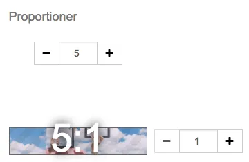
Prepare sharp images and choose the right aspect ratios so that products and messages are not cropped in the store. This guide applies to store administrators in Go, Plus, and Pro. Product images are uploaded to the product; images for custom pages and many theme blocks are managed via Appearance → File archive or the block's image selector. The theme settings below apply to Diversity. TPL and custom themes may have different fields and image rules; check the active theme first. 1. Distinguish between pixel dimensions, aspect ratios, and file size Pixel dimensions specify the image's width and height, for example 1500 × 500 pixels. The aspect ratio is then 3:1. The file size, for example in kB or MB, indicates how much data the file contains. A larger file is not automatically sharper. 500 × 100, 1500 × 300, and 3000 × 600 pixels all have the aspect ratio 5:1, but different levels of detail. Start with the image's largest display size and choose enough original pixels. Enlarging a small file does not create new details. Edit the subject, cut-out, background, and retouching in an image editor before uploading. For example, you can use GIMP, Paint.NET or Pixlr. The theme's scaling and cropping control the display; it is not the same as editing the original's subject. 2. Choose aspect ratios for the slideshow Open Appearance → Themes → the active theme → Edit → Content → Home page and select the slideshow block. Choose aspect ratios that suit both the subject and the page layout. Example: 5:1 An image of 1500 × 300 pixels has the same aspect ratio as the 5:1 setting. Example: 3:1 An image of 1500 × 500 pixels has the aspect ratio 3:1. If a very wide image needs to fill a taller image area, parts of it may be cropped. The theme adapts the image to the display area and settings; it cannot automatically determine which subject must remain. The following example shows how text is cropped when the aspect ratios do not match. Check on both mobile and desktop. Do not place important information only as text within the image; use the block's text fields when possible and keep important subjects away from edges that might be cropped. 3. Upload and configure product images Open Catalogue → Products and select the product.Open the product's image management under Edit → Images and upload the original image.Open the active theme and Style → Images.Select the aspect ratio, whether the image should be cropped or fit within the image area, and which part of the subject to prioritize where such options are available.Save and check both the product list and the product page. For square images, select 1:1. For example, 1000 × 1000 pixels provide this aspect ratio, but it is not a universal upload limit or a requirement for all sales channels. For landscape images, for example, 1500 × 1000 pixels is a 3:2 aspect ratio. The setting and the subject determine how the image fills the area. 4. Set up product group images Open Catalogue → Product groups → select group → Edit → Properties and the field for the image in the product group table. In the theme, select the group image's aspect ratio under Style → Images. Example with 1:1 and square originals: Example with 3:2 and landscape originals: 5. Adapt images for storefronts Storefronts can use a 5:4 aspect ratio. However, check the current block's settings; a different theme or configuration might use other aspect ratios. The number of blocks in the row affects how large the image is displayed, not how much detail the original contains. For 5:4, you can use, for example, 1000 × 800, 1500 × 1200, 2000 × 1600, or 2500 × 2000 pixels depending on the display size. More pixels are needed when the same subject is displayed larger. Do not use these examples as a rule that a specific column layout must have an exact pixel dimension. 6. Choose a format and manage transparency JPEG: is suitable for photographs and does not have a transparent background.PNG: can preserve transparency. A white background that is already part of the pixels does not become transparent by renaming the file to PNG.WebP: can result in smaller files. Check for support in the specific upload field and the channel where the image will be used.SVG: can be used for some logos and illustrations where the field supports it. Only upload SVG files from a trusted source. The product image upload does not accept SVG; a format that works in the file archive will not automatically work on the product. If the background looks wrong, open the original file in an image editor and check if it actually has transparency. Then, check if the theme's image area has its own background or cropping. The theme's background color cannot remove a baked-in white background from a subject. 7. Check external image requirements and accessibility An image that looks good in the store may still be too small or have the wrong content for Google Merchant Center. Check the image URL that is actually sent in the product feed's image_link, not just a small preview. The main image should show the actual product; do not use a logo, promotional text, or placeholder as a substitute. Google has announced a minimum of 500 × 500 pixels for product images from January 31, 2027. Prepare sufficiently large originals now and follow Google's current image requirements and any warnings in Merchant Center. An approved upload in Abicart is not an approval from an external sales channel. Use a consistent image template and supplement it with relevant angles, details, and size references. Feel free to show the product in use when it helps the customer understand its size or function. Give the file a descriptive name before uploading and write short alternative text in the image field that supports it. Describe the image's content and function without listing keywords. Purely decorative images can have empty alternative text. Quick start Identify the image's location and the active theme's proportions.Prepare a sharp original with the right subject, background, and format.Upload to the product or select the image in the correct block.Check the cropping on mobile and desktop, as well as external image requirements if you use product feeds. Subscription Product images and basic image management are available in Go, Plus, and Pro. The theme's settings and the respective upload field's format and file limits apply. External channels have their own image requirements that are not determined by the Abicart subscription.
-

Edit footer content, contact details, and logos
27 Nov 2025
Help visitors find contact details, important links, and the right payment information at the bottom of the store. This guide applies to Diversity themes in Go, Plus, and Pro. Go to Appearance → Themes → edit the active theme → Content → Footer. TPL has a different theme editor. Check the active theme if you don't see the fields described here. 1. Select content for the right part of the footer The footer is displayed at the bottom of the store's pages. The theme has several content fields, such as left, center, and right, and may also have an area for brand logos. The available options depend on the theme and the field. Choose what a field should contain before editing its settings. Distinguish between a regular custom content field, social icons, the address block, brand logos, and a special payment component. They have different functions and cannot always be selected in the same place. 2. Add custom text, links, and images Select Custom HTML or Custom content in the field you want to edit. There you can write text, add links, and insert images, such as your own informational or payment images. Select the correct language tab for the text. Use the image icon Insert/edit image to select or insert an image using the editor's image function. Check the image's size, alt text, and any link before saving. 3. Change address and contact details Select Address in the left field when using the pre-made contact block. Fill in the address lines, email, and phone number for the correct language. The phone number displayed to the customer and the number dialed when clicked are separate fields; the clickable number should have a country code and no spaces. If the address in the store doesn't change, it might be entered in a custom HTML field or in another theme copy instead. Check the location that is actually displayed. The footer's free contact text is not the same setting as the company details on order documents and in the admin. 4. Add social media In the footer fields that support Social media icons, usually the right-hand fields in these themes, select an icon and enter the full link to your company's profile. An icon without the correct link won't help the customer find your account. Check each link after saving. 5. Select brand and payment information Under Brand logos you can add, arrange, and remove the logos to be displayed. Choose light logos for dark backgrounds and dark logos for light backgrounds. The preview in the admin list itself may show black logos even when white is selected; check the color in the store's preview. Only display logos for payment and shipping solutions that the store actually offers. Changing a logo does not activate a new payment method. Kustom's logo and Klarna On-Site Messaging are different things; do not swap one payment component for another just because the names are similar. If the theme offers Payment method information for Klarna Checkout in the right-hand field, it is a specific older payment component, not a general logo selector. Klarna On-Site Messaging, where available for the store's payment and theme configuration, has its own terms and appearance settings. Select the component that corresponds to the store's actual setup. 6. Save and check the store Save the theme and preview the footer on both mobile and desktop, in every language you have changed. Check that the contact details are correct, links work, logos are visible against the background, and that the correct active theme is displayed. Quick start Edit the active Diversity theme and open Content → Footer.Select the correct field and content type.Change text, contact details, links, or logos in the correct language.Save and check the store's footer on mobile and desktop. Subscription and theme Diversity themes and footer editing are available in Go, Plus, and Pro. Some external payment, review, or newsletter features require the corresponding service and feature to be available. The guide describes Diversity, not TPL.
-

Build and arrange the home page blocks in your Diversity theme
27 Nov 2025
Build a home page where visitors can find products and information, and customize the order and content for both mobile and desktop. This guide applies to Diversity themes in Abicart Go, Plus, and Pro. Which blocks and settings are displayed depends on the active theme, theme version, and the store's features. TPL has a different editor. The store's own newsletter block requires Plus or Pro; external services require their own accounts and terms. 1. Open and edit the correct home page Open Appearance → Themes and edit the active Diversity theme.Select Content → Home page.Click an existing block to change its settings, or select Add block for new content.Drag the blocks in the list to change the order. For example, move a custom content block with a map further down if that's where the map should be displayed.Check the language fields, finish editing the block, and save the theme. Changing the image size in an image file does not turn a three-column block into a single wide block. Choose a block layout that suits the content. A single showcase, two, three, and four showcases are different choices. A full-width product block displays one product; it is not a general full-width mode for all types of blocks. 2. Choose blocks based on the task Products and featured product groups Products: enter a title and select a source, for example, all products, a product group, new arrivals, latest, sale prices, or a manual selection. For automatic lists, you choose the sorting, for example, price, name, product number, created, popularity, or stock. Select grid, list, or carousel, limit the number of products, and set columns for desktop, tablet, and mobile where a grid is used. Featured product groups: enter a title, search for a product group, and click Add product group. Repeat for the groups you want to display. Full-width product: select the product and whether to display the price, description, buy button, and any attachment link. Check that the product is visible and purchasable for the intended customer type. Custom content, images, and showcases Custom HTML: use the text editor for headings, body text, text size, alignment, bold/italic text, colors, images, video, and links. The code button opens the HTML mode. Only paste trusted code and check how external embeds interact with the store's consent settings. Slideshow: select images from Appearance → File archive. Set automatic switching if it is to be used, select slide or fade, as well as proportions and cropping. Make sure that important text or motifs are not cut off on mobile devices. Showcase: A showcase can contain an image, three lines of text, and a link to a product, product group, custom page, or external address. Choose one, two, three, or four showcases depending on the desired layout; multiple showcases will be displayed side-by-side where screen width allows. Square slider: a smaller square slideshow with an image and a link. Newsletter signup Subscribe to newsletter: Enter the text above the email field and the confirmation text after signup. The visitor can submit their email address without first creating a regular customer account. The address is transferred to the store's customer registry for newsletter management. The block and the store's own newsletter feature are included in Plus and Pro. Mailchimp form: If you use Mailchimp, retrieve an embedded signup form from your Mailchimp account and paste the form code into the block. This is a signup to Mailchimp and should not be confused with Abicart's own newsletter block or a complete e-commerce integration. Instagram, reviews, and external feeds Instagram: Add the block, use its connect button, and log in to the correct Instagram account to grant the requested access. Finalize the return to the editor and save. If the connection needs to be renewed, use the connection feature again. Do not share the access key in the page's visible HTML. If the heading is displayed but no images are visible, first check if other visitors are experiencing the problem. Try a clean browser session and check for consent or content blocking. If the error affects everyone, check the account connection and any error messages. Adding the same block multiple times will not fix a faulty connection. Trustpilot: retrieve the intended embed code from the correct account and paste it into the block's field. Flowbox: enter the correct Flowbox key and save. What data is displayed and which services are included are controlled by the respective external service and agreement. Countdown and selling points Event countdown: select when the block should start displaying and the end time it should count down to. Enter the content that precedes the timer and choose background cropping, text colour and whether to show the timer. Check the time settings before a campaign. Follow the event countdown setup guide for details. Unique Selling Points: Add short selling points in the block provided for the home page. If you want selling points in the header, use the header's own settings, if the theme has them. A block on the home page does not automatically create a slideshow in the header. 3. Review and troubleshoot before you finish Wrong order: arrange the blocks in the start page's block list, not by changing the content of an image.Wrong width: check the selected block and its column/image settings on mobile and desktop. A map embed can also have its own fixed width in HTML.Products missing: check the block's selection, sorting, and quantity, as well as the products' visibility.Change not visible: check that the correct theme, language, and start page are saved and displayed in the preview.Want to measure clicks: a block or a link does not automatically mean that a specific click report is available. Decide which links to measure and check separately that the chosen analytics solution registers them without duplicate tags and with the correct consent. Quick start Edit active Diversity theme → Content → Start page.Select, edit, and arrange blocks according to the visitor's task.Check content and links per language and save.Preview on mobile and desktop and check external connections. Subscription and theme Diversity themes are available in Go, Plus, and Pro. Newsletter subscription requires Plus or Pro. The range of blocks varies between themes and versions; external services may require separate agreements. This guide does not apply to the TPL editor.
-

Preview themes in mobile view
27 Nov 2025
Here we go through how to preview themes in mobile view for different browsers. Most browsers have tools that resize the window to mimic the look of a mobile or tablet. Since many end customers make purchases on mobile and tablet, it can be interesting to preview a new theme you've created, for example, so that you also know how the look of the store will look to those customers.Previewing with Firefox, Google Chrome and EdgeWhen previewing an active or inactive theme under Appearance>Themes, do the following to open the inspection tool in the browser:Firefox: Ctrl + shift + MGoogle Chrome: F12 and then Ctrl + shift + MEdge: F12 and then Ctrl + shift + MNow the inspection tool is running, you can then choose to widen the height or width of the view itself , or choose one of the preset sizes to mimic how it would look for a number of different devices.Previewing with SafariWhen previewing an active or inactive theme under Appearance>Themes, do the following to open the inspection tool in your browser:1. Safari menu> Preferences> Advanced2. Tick the box for "Show develop menu in menu bar"3. "Develop" is now an option in the menu bar in Safari. Click on Develop-> "Responsive design mode"Now the inspection tool is running, you can then choose to widen the height or width of the view itself, or choose one of the pre-set sizes to mimic how it would look for a number of different devices.To preview with Safari you need to go through a few more steps, so we recommend using a Firefox, Chrome or Edge in the first instance for mobile view previews.
-

Add a logo to your webshop
27 Nov 2025
One of the easiest ways to make your shop more personal is to add your own logo that is visible in the shop. The logo is added to the theme that you use in the shop, go to: Appearance->Themes->Click on "edit" on the active theme->Click on the "Style" tab. Upload your logo here or add your shop name in text if you don't have a logo: You have the possibility to adjust the proportions based on the logo you upload, if you have a square image you choose 1:1 in proportion while for a more rectangular image you need e.g. 5:1. Click here for more information about proportions.You can set the maximum width of your logo to prevent it from being too large or too small: Under Appearance->Logo you can also add a logo. The logo you add there is only visible in documents you can extract from your orders, such as receipts and packing slips.
-

Edit theme (Home page)
27 Nov 2025
Good to know!Settings in themes may differ depending on the theme you have chosen. Add a theme There are currently 8 different themes to choose from, all with different designs.Add the one that suits you best. 1. go to Appearance in the left menu2. click on Themes3. Select the Theme Templates tab4. Add: Select the theme you want to use in your store. Demo: Here you get a glimpse of what the theme might look like.Learn more: Click here to get some extra information about the theme. Under the tab My themes you will find your added themes, this is also where you edit them. Editing a theme You can create copies of a theme. Perfect if you want to experiment, or if you want to have seasonal themes. To edit a theme, click on the pencil on the right. Content of the themes Under the tab Content you choose how each page should look and function in the store. For example, what information your Footer should display or how you want your Menu to function. You create your start page by adding different blocks.You can change the position of the blocks by dragging and moving them. Always finish by clicking on Save Remember to save! Once you have made changes to a tab, you must always save before moving on to the next one. Style Under the tab Style you choose the colors and fonts you want in the store.You also upload your logo and choose how you want the store images to be cropped.If you know CSS, you have the opportunity to add this under Custom CSS.CSS is a code language that we use in Abicart. Tip!When choosing a logo, choose one without a background.Click below for a more detailed description of the logo.Manual - Add and edit your logo Additions Under the tab Add-ons you will find some goodies.This is where you connect analytics tools to the store. You edit functions that are linked to the theme, for example Cookies or Text banner and under Own content in HEAD you can add your own code.